Notehead Shapes Refined
In addition to the new key signatures covered in the previous post, the latest clairnote-code.ly clairnote.ly file (see Software:LilyPond) also includes revised notehead shapes. These new shapes provide a little polish, a touch of subtle refinement for the aesthetics of Clairnote sheet music produced by LilyPond. Lets take a look!
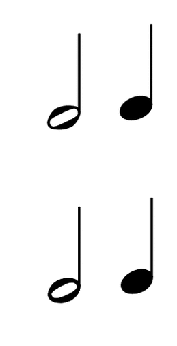
Here are the previous shapes which are from LilyPond’s default Emmentaler font, but rotated clockwise slightly (9 degrees) so that they are a little less slanted.

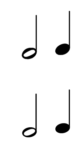
And here are the new default shapes for Clairnote:

It’s a pretty subtle difference, so here’s a zoomed-in image (an animated GIF) that alternates between the previous and current defaults every two seconds.

With the previous shapes there is more of a difference between the hollow and solid notes – a slightly different shape and size. With the new shapes the hollow noteheads have a nice round feel and are better matched with the solid notes – they feel more like two versions of the same thing. Part of this is that the new hollow notes have a little more visual weight or prominence on the page that better matches, pairs with, or balances out that of the solid notes.
So where did these new shapes come from? They are borrowed from the Bravura music font which, as that blog post puts it, has noteheads that are “nice and oval” and “relatively large in comparison to the space size, aiding legibility.” For use in Clairnote they have been converted first to SVG images and from there to path coordinates that are embedded directly in the clairnote.ly file. (That way there’s no need to bother with another file, like a separate font file.) In the process the glyphs have also been slightly modified – rotated clockwise a smidgen (4 degrees) and then scaled vertically by 0.9299 to match the height of the previous note shapes. (Note that only these two shapes have been borrowed from Bravura. The rest of the font is not used.)
In the process of experimenting with different notehead shapes, I also tried the shapes for the note “sol” from the “Funk” collection of shape notes included in LilyPond’s Emmentaler font. These are basically small and circular, but I scaled them horizontally (by a factor of 1.35) to about the usual width of a notehead. This turned out pretty well, so I decided to keep them as an option. Here’s what they look like:

And here’s another animated GIF that alternates between the new defaults and these “funksol” shapes, which are a little smaller and offer a flatter, less slanted look.

The clairnote.ly file now supports using different notehead styles via a new \cnNoteheadStyle command. This makes it easy to use the previous LilyPond/Emmentaler-based note shapes or the “funksol” shapes instead of the new Bravura-based defaults. For even more customizability and to make experimenting easier, the height or width of the noteheads can be changed by setting two new custom context properties cnNoteheadWidthScale and cnNoteheadHeightScale. Documentation on how to use all these options is on the Software: LilyPond page.
Note that the shape of whole notes currently remains the same (the Clairnote default) with each of these notehead styles.
All of the sheet music on the Clairnote site now uses the new notehead shapes, although most of the images on the site still show the previous shapes.
Ok, that does it for the new notehead shapes! There are still a few more recent improvements that will be covered in a future post.
Update: the “clairnote-code.ly” file was renamed “clairnote.ly” on May 15, 2017.