Double Stems Revised
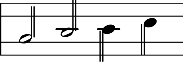
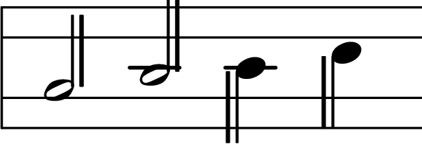
I received some feedback that the double stems on half notes were too subtle and too easily overlooked in the Clairnote sheet music produced by LilyPond. This was especially the case when viewed on a computer screen at lower resolutions where the two stems tended to blur together. So I have revised them to make them clearer and harder to miss. The two stems are now a little further apart and the second stem is a little thicker than the first.
Previous Stems:

New Stems:

The new stems are already in the current clairnote-code.ly clairnote.ly file that is available for download from the Software: LilyPond page. Eventually they will make their way into the sheet music and images on this site. But what if you like the old stems better than the new stems?
One of the great things about LilyPond is how thoroughly tweak-able, override-able, and customizable everything is. Why shouldn’t Clairnote, as rendered by LilyPond, be tweak-able too? Indeed, you can now easily change the appearance of the double stems by overriding the values of two custom staff context properties that determine how thick the second stem is and how much space there is between them. Just put the following in your .ly file and adjust the settings as you see fit:
\layout {
  \context {
    \Staff
    cnDoubleStemWidthScale = 1
    cnDoubleStemSpacing = 3
  }
}
(See The Layout Block in the LilyPond documentation.) You can also customize only a single staff, like so:
\new Staff \with {
  cnDoubleStemWidthScale = 1
  cnDoubleStemSpacing = 3
}{
  c'2 d' e' f'
}
The settings shown above will recreate the previous default double stems. cnDoubleStemWidthScale scales the second stem by the given amount. The new default is 1.5 times as thick as a standard stem. cnDoubleStemSpacing is measured in units of one standard stem width, and the new default is 4.5.
[Update: this post has been edited to reflect changes to the syntax for customizing the appearance of double stems. Custom staff context properties are now used instead of custom grob properties. – October 18, 2015]
Note the “cn” prefix which distinguishes custom Clairnote properties and commands from standard LilyPond properties and commands. The commands for changing the number of octaves a staff spans now use this prefix too. For example, \threeOctaveStaff is now \cnThreeOctaveStaff. These are documented on the Software: LilyPond page.
Vertical Staff Compression
There are some more improvements that deserve their own post and their own illustrations. I’ll just briefly mention one here. The Clairnote staff is now a little less vertically compressed than it was before, at least with the default settings. The thinking is that a little less compression is probably easier to read and more aesthetically pleasing (more on this in a future post).
Here are the numbers. Previously the distance between the midpoints of vertically adjacent noteheads was 0.7 times (7/10) what it is in traditional notation. Now it is 0.75 times (3/4) that distance instead. An octave in Clairnote was previously 1.2 times (12/10) the size of an octave in traditional notation. Now it is 1.2857… times (9/7) that size.
If you like the previous amount of compression better (or some other amount), then it is easy to customize this as well. Use the new \cnStaffCompression command by adding the following to your .ly file:
\layout {
  \context {
    \Staff
    \cnStaffCompression 0.7
  }
}
A value of 0.7 will set the compression to its previous level. Here’s how to customize only a single staff:
\new Staff \with {
  \cnStaffCompression 0.7
}{
  c''1
}
Download the new clairnote.ly file (version 20151006) from the Software: LilyPond page. There’s more to come about staff compression, optional notehead styles, and the SystemStartBar in a future post.
Update: the “clairnote-code.ly” file was renamed “clairnote.ly” on May 15, 2017.